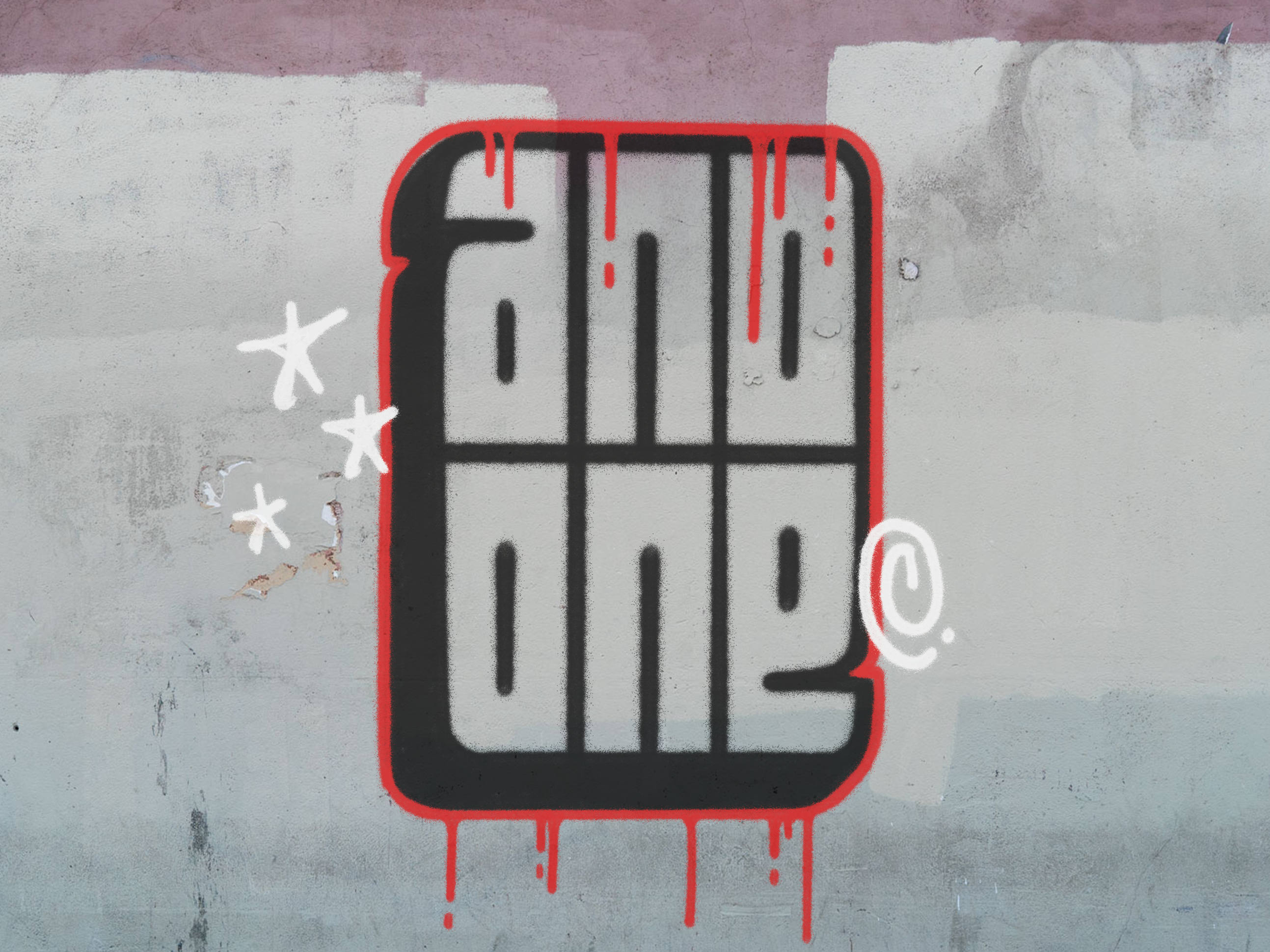
Human is an activity based social media platform that connects users through organizing different events and activities that they can sign up for. Human aims to reduce the time individuals spend on their screens, and encourage them to get outside and make new connections.
Over the past few years, we have seen an increase in young adults and adults spending far more time on their screens than what is healthy. There are many factors that have led to this reality, with the COVID-19 pandemic having a huge impact on the way we interact with others. Many individuals have become accustomed to having most of their social interactions taking place online, though this is not a true connection and will likely not fulfill one's social needs. For many people however, social media and the internet might be their only option for interacting with others. The goal of this app is to create a platform for users to connect with each other and participate in different activities based on their individual interests. We aim to utilize the platforms that many people get stuck scrolling through, and reframe it so the purpose of the app is to actually get outside and experience real connections with other humans.
Research
For the initial product research, I gathered extensive information on two of the most popular social media apps, Instagram and BeReal. In my analysis, I examined the various features offered by these apps and have taken into account my personal preferences, highlighting both the aspects I appreciate and those that I find less appealing. Through this evaluation, I aim to provide a detailed and comprehensive understanding of these social media platforms, shedding light on their strengths, weaknesses, and overall user experience.
I developed an empathy map to gain a deeper understanding of how my target audience feels. By creating this map, I was able to identify and analyze their emotions, thoughts, and behaviors. This insight allowed me to adjust my approach and design strategies that effectively connect with and resonate with my target audience. This also helped guide my personas, helping me develop a more focused and specific perspective from my audience.
Process
Before starting any designing, I created a plan for my different pages. A full list of pages and features within each page was laid out to create a guide for wire framing, and eventually designing and prototyping.
Hand-rendered wireframes with detailed annotations are utilized to provide in-depth information about the various features and elements present on each page. This approach not only enhances the overall understanding of the design and functionality, but it also allows for a more thorough exploration and analysis of both visual and interactive aspects of the interface. By incorporating these detailed wireframes, I can gain a deeper insight into the intricacies of the user experience, driving more informed decision-making and ensuring the creation of a user-centric final product.
Results
The final design and layout was selected for its overall positive user experience, and the simple and navigable interface. The colours used within the app align with the palette selected for the branding, while ensuring high contrast and legibility between different components. Colour was also used to emphasize and differentiate certain elements. Line weight for certain objects and typography also gave me the opportunity to create a sense of hierarchy within the pages. The onboarding process is simple and easy, giving the user the option to select their interests based on a wide range of options, as well as offering instructions on how the app works, including descriptions on each page and the features within them.


