AND ONE
Overview
This project is a zine series that curates documented graffiti works and related content. The purpose of this zine echos other contemporary and historic zines; it speaks to a niche audience of existing enthusiasts and participants of the anarchical culture. This project aims to capture a snapshot of what is happening now within region-specific small graffiti crews. In other words, it acts as a time capsule that serves as an inspiration repository, expressive outlet, and storytelling vessel.
Within the graffiti community, there is minimal open discussion due to the desire to protect spots, and out of the necessity to remain anonymous for fear of prosecution. The zine format is well-suited to displaying graffiti works because zines are not subject to the typical editorial process; censorship and academic credibility do not apply, providing a space for free expression. The absence of an extensive editorial process also allows zines to be produced faster, and facilitates dissemination within the target audience.
Problem definition
Although zines, magazines, and social media coverage exist within the graffiti community, there is a relative lack of strong design compared to other artistic mediums. This disservices the otherwise impressive art. Strong design, though an objective concept, has largely become institutionalized, rendering its principles lesser known to graffiti artists. Graffiti is not usually present in institutional settings due to its underground community and criminal nature. It is therefore rare, and perhaps against the culture for graffiti works to be displayed in galleries. But every art medium deserves a platform through which works can be shared, celebrated, and criticized.
Project Team
Audience
This zine series is intended to target core members of the graffiti community. More specifically, it is for individuals who actively participate in the illegal act of graffiti, are involved in the underground community, and can relate to the content published in the zines. This would primarily include young adults, predominantly male, between the ages of 20-28. This zine is not intended for the general public, and is not seeking to validate the artform or normalize it within society.
Project Objectives
-to create another platform for graffiti artists to promote, share, and document work
-to introduce the graffiti scene to graphic design that applies principles of “good” design, to meet the wants and needs of those artists.
It should be noted that “good design” in this context will be defined as print design that integrates principles and rules set by practicing visual designers and educators. For instance, this zine uses grid systems, considers AODA standards, and minds typographic faux-pas. That isn’t to say rules can’t be broken; design within this zine is also experimental to suit the chaotic and disruptive nature of graffiti.
Tools & Software
- Traditional media
- Digital photography, disposable cameras
- Adobe InDesign
- Adobe Photoshop
- Adobe Illustrator
Deliverables
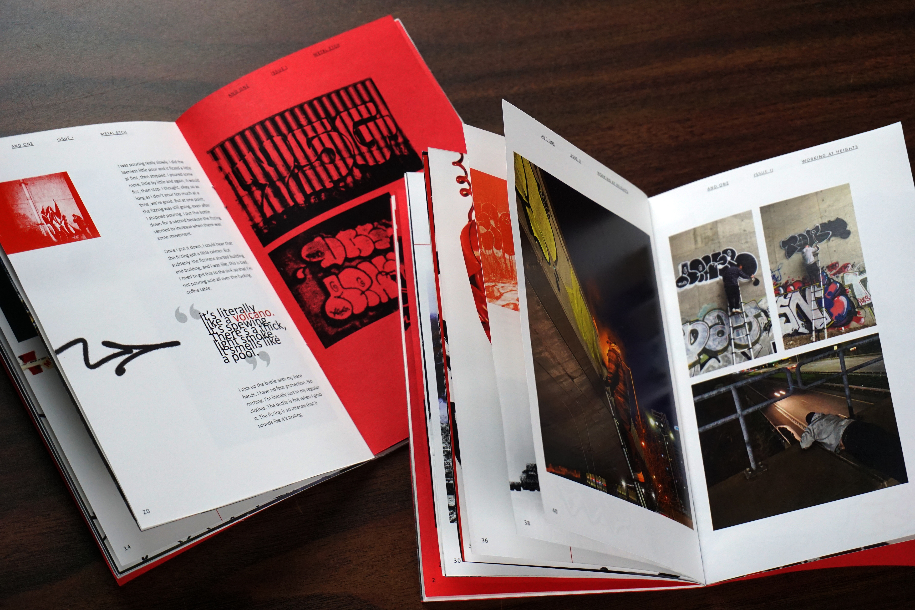
- Two printed zine issues
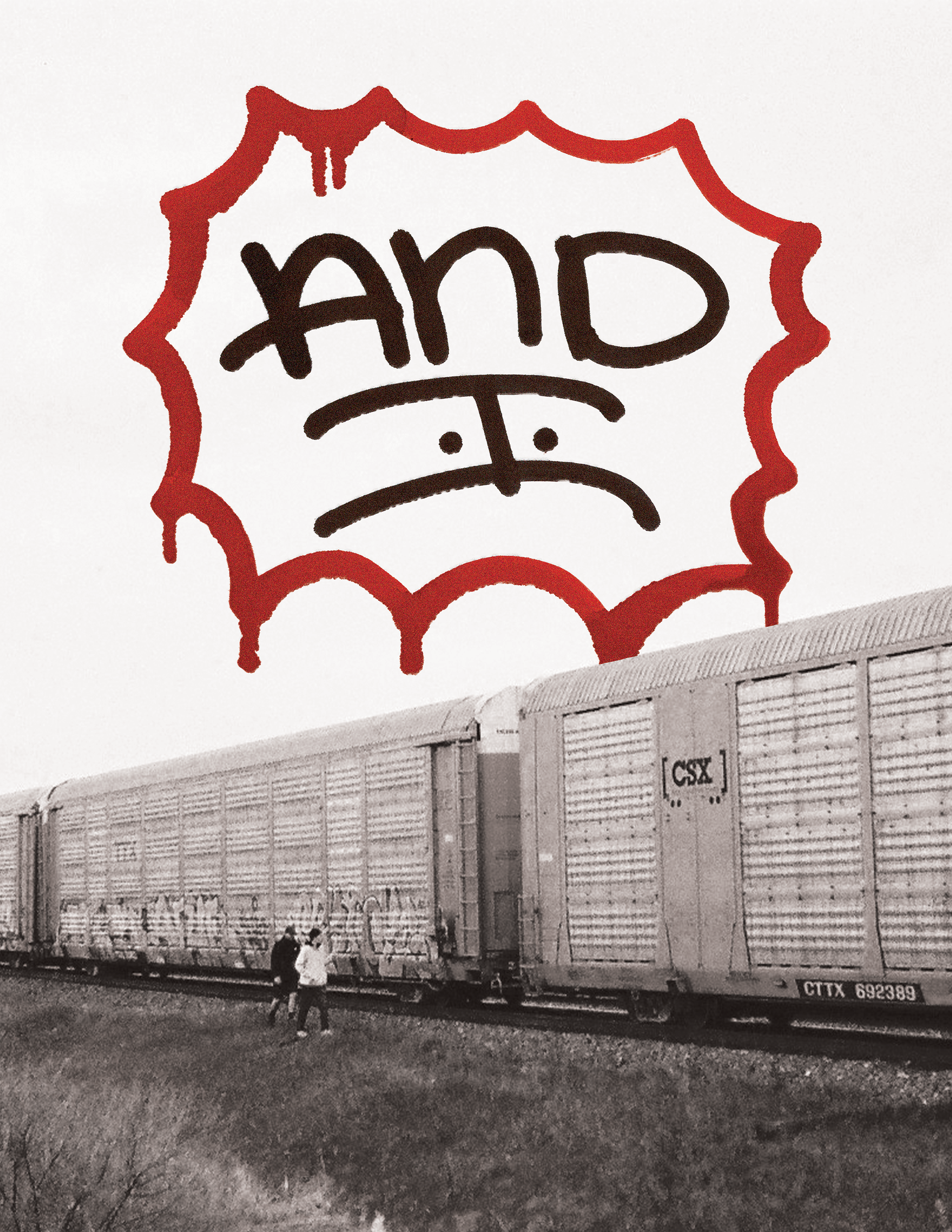
- Two posters
Content & design decisions
The title AND ONE is a term drawn from basketball, which is when a player successfully makes a basket while an opposing player makes direct contact with them, or fouls them. This then grants the offensive player another opportunity to score a point, unopposed. There is a strong connection that can be made between this and graffiti. The act of graffiti can be considered an and one itself: writers taking the offensive, going out with the goal of putting their name on everything they can, while general society and law enforcement take the defensive, doing whatever they can to prevent writers from completing their goal. Even when “contact” is made (in the form of prosecution or public dissent), writers continue to find opportunities to get their name up.
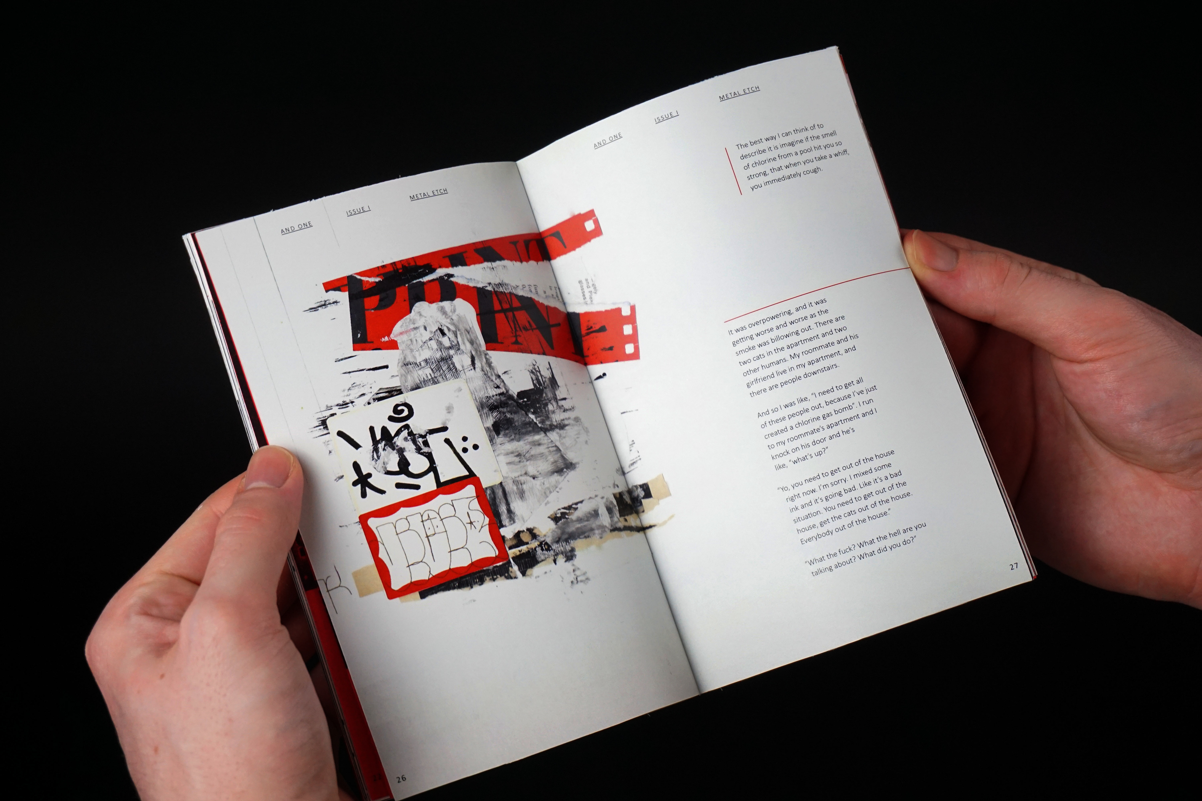
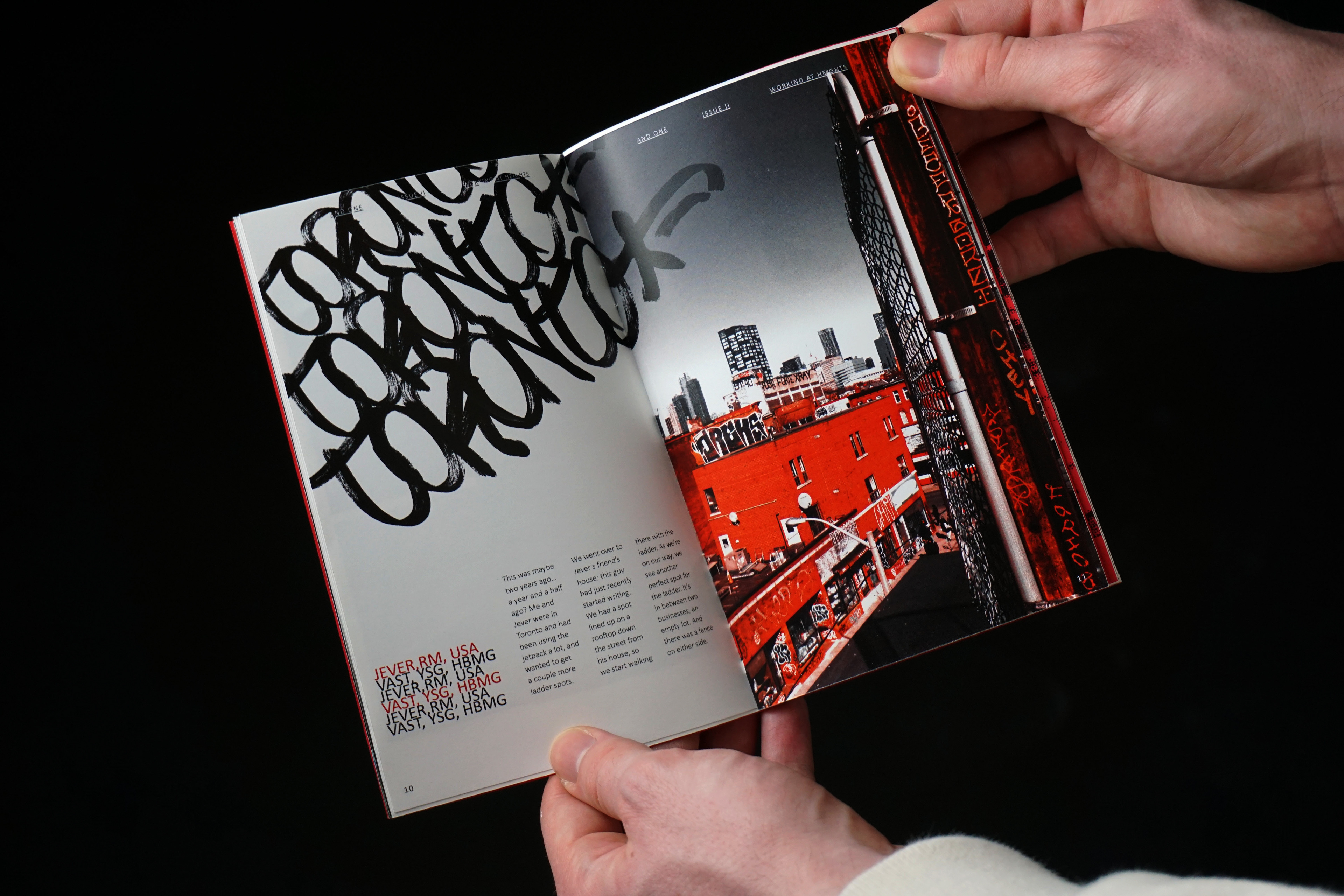
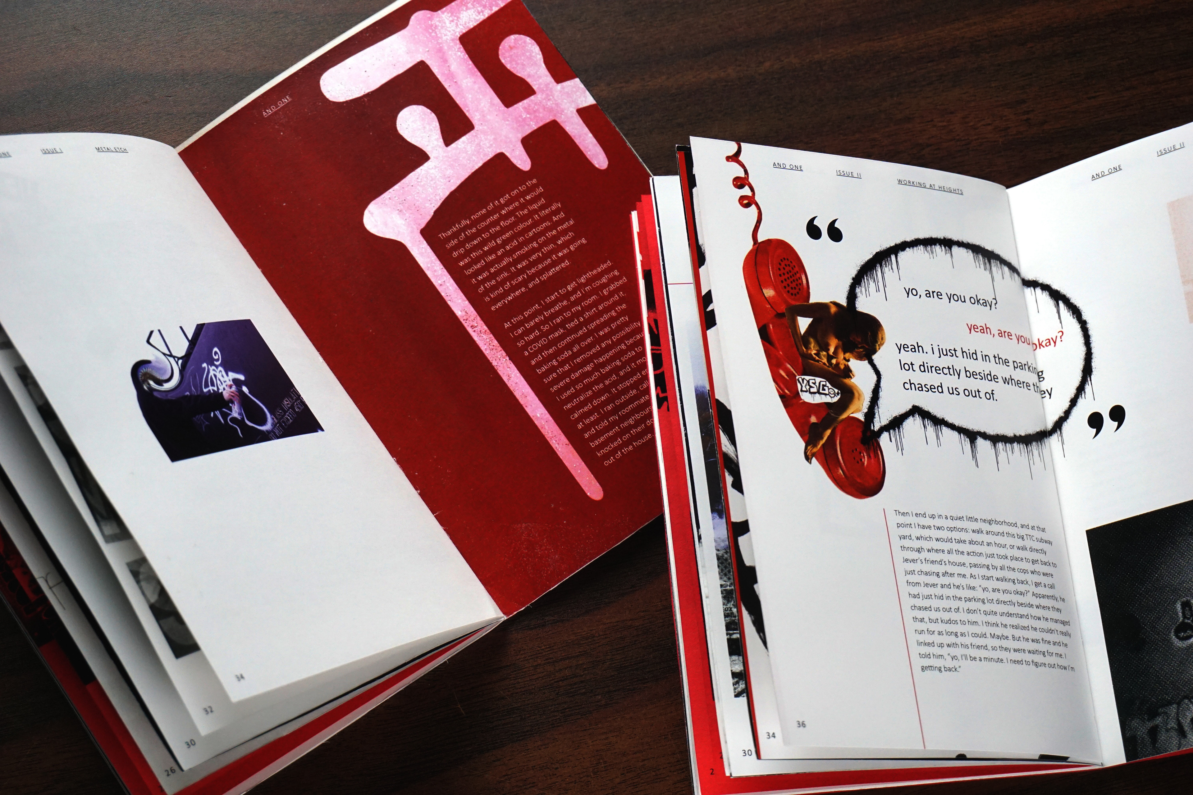
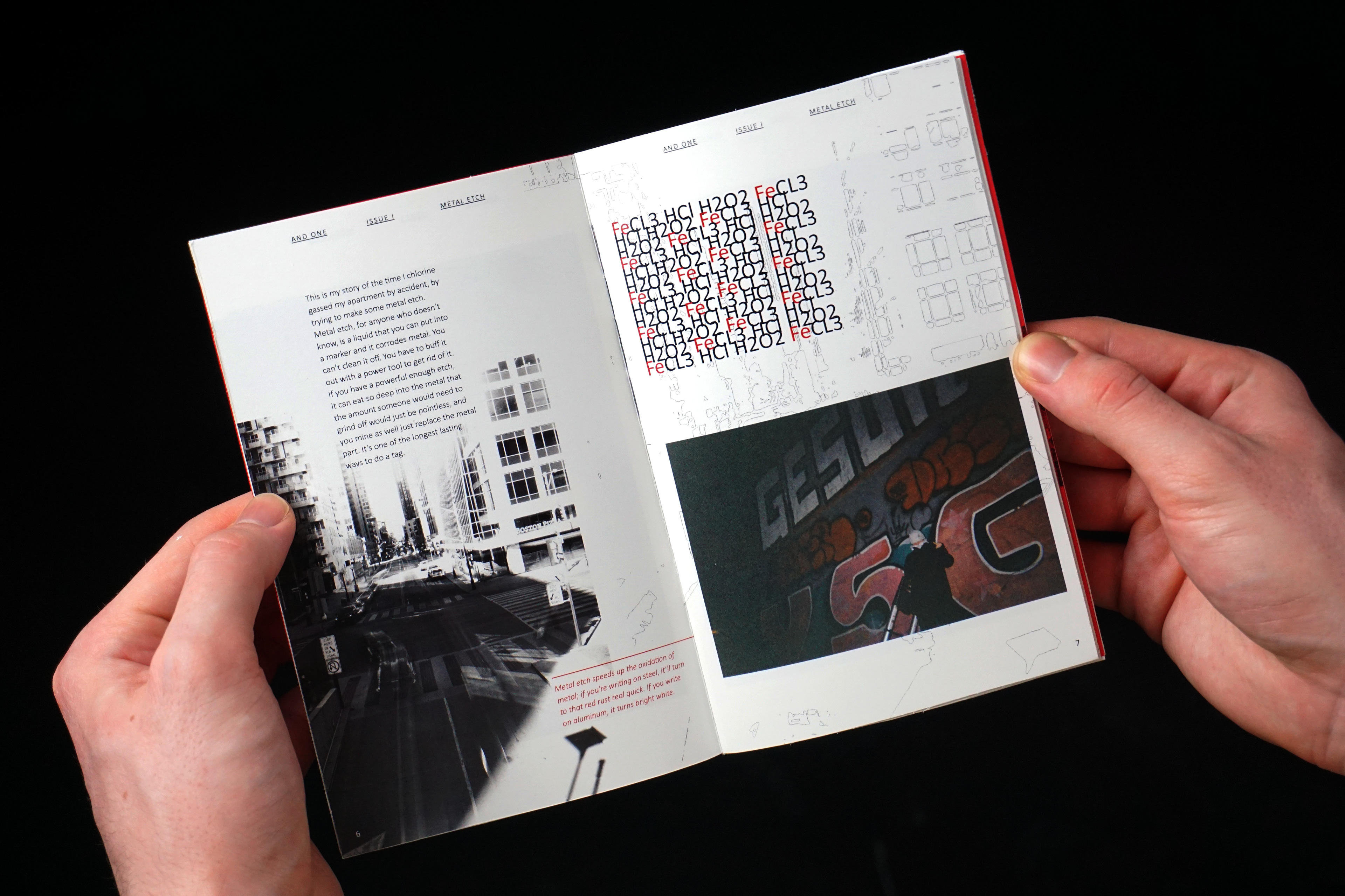
In order to balance the busy, colourful, and expressive graffiti letterforms and illustrations, the zine adheres to a 5 column grid system with consistent parent pages (with folios and headings). The sans serif typeface Calibri was chosen as the sole font family due to its consistent letterforms and kerning, high legibility, and simplicity. Commonly used assets include duotones in red, and black and white halftones.
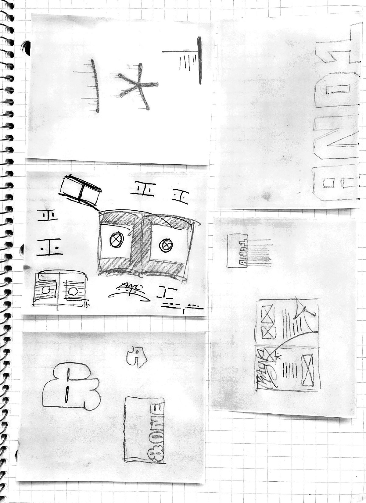
Two issues of AND ONE have been developed and printed. All content is original, including disposable camera and digital photography, collages, illustrations, sketchbook pages, and transcribed stories from local graffiti artists (typically referred to as “writers” within the graffiti community). The written content of each issue focuses on a story from different writers, and the issues are titled based on the featured story.
Result
These preliminary issues received positive feedback. Sharing copies within the graffiti community made others eager to both purchase and participate in future issues.
Apart from improving the medium through which graffiti works can be displayed, there are other merits to good design. Good design helps further democratize and clarify messages by increasing accessibility. It effectively organizes content and information, which makes it more digestible and understandable. Design is therefore multidisciplinary and important in all applications. Integrating “good” design within other disciplines also forces designers to see art through different lenses which fuels creativity, leading to advancements in design itself.
